Creative Obrero Euskadi logo
Creative Obrero Euskadi logo
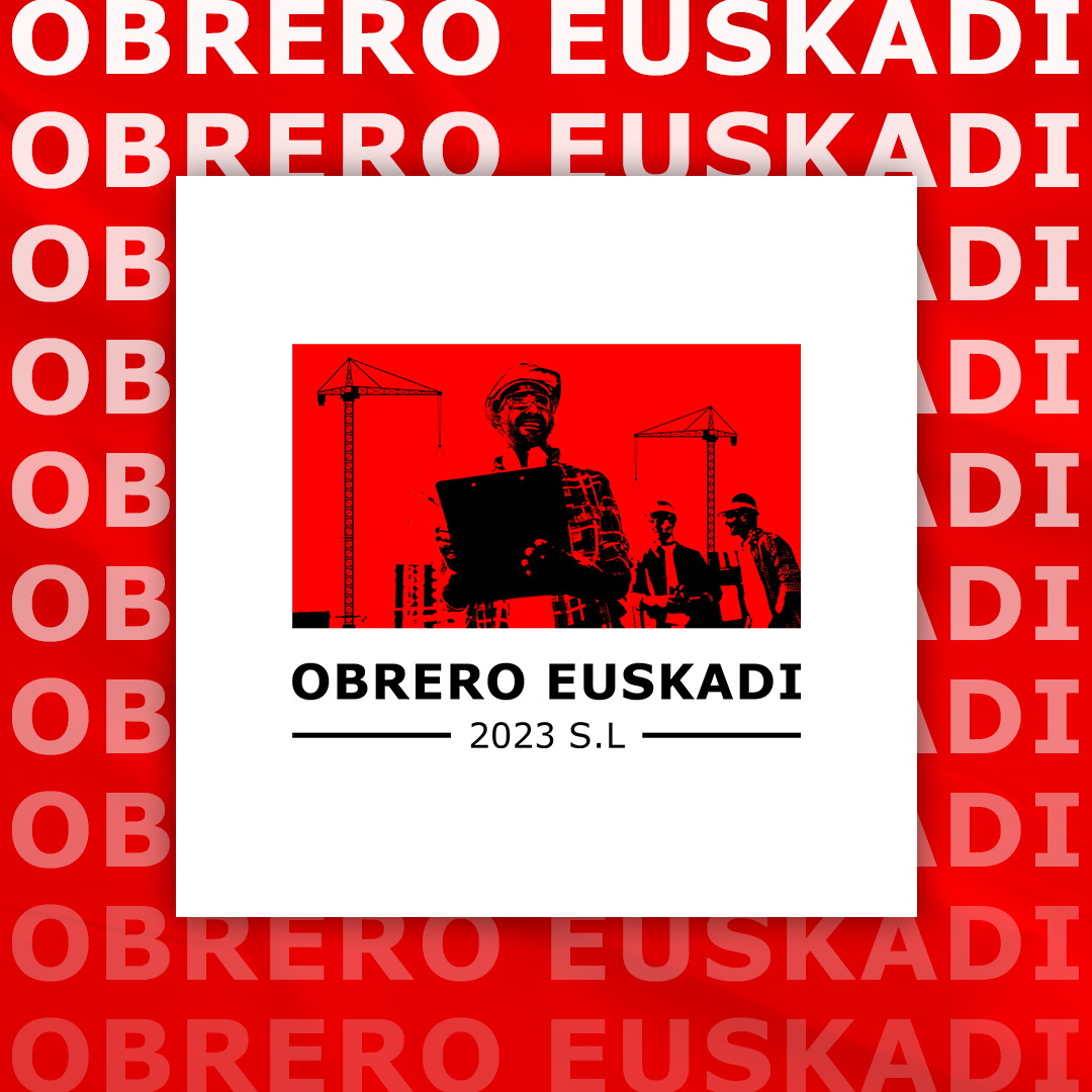
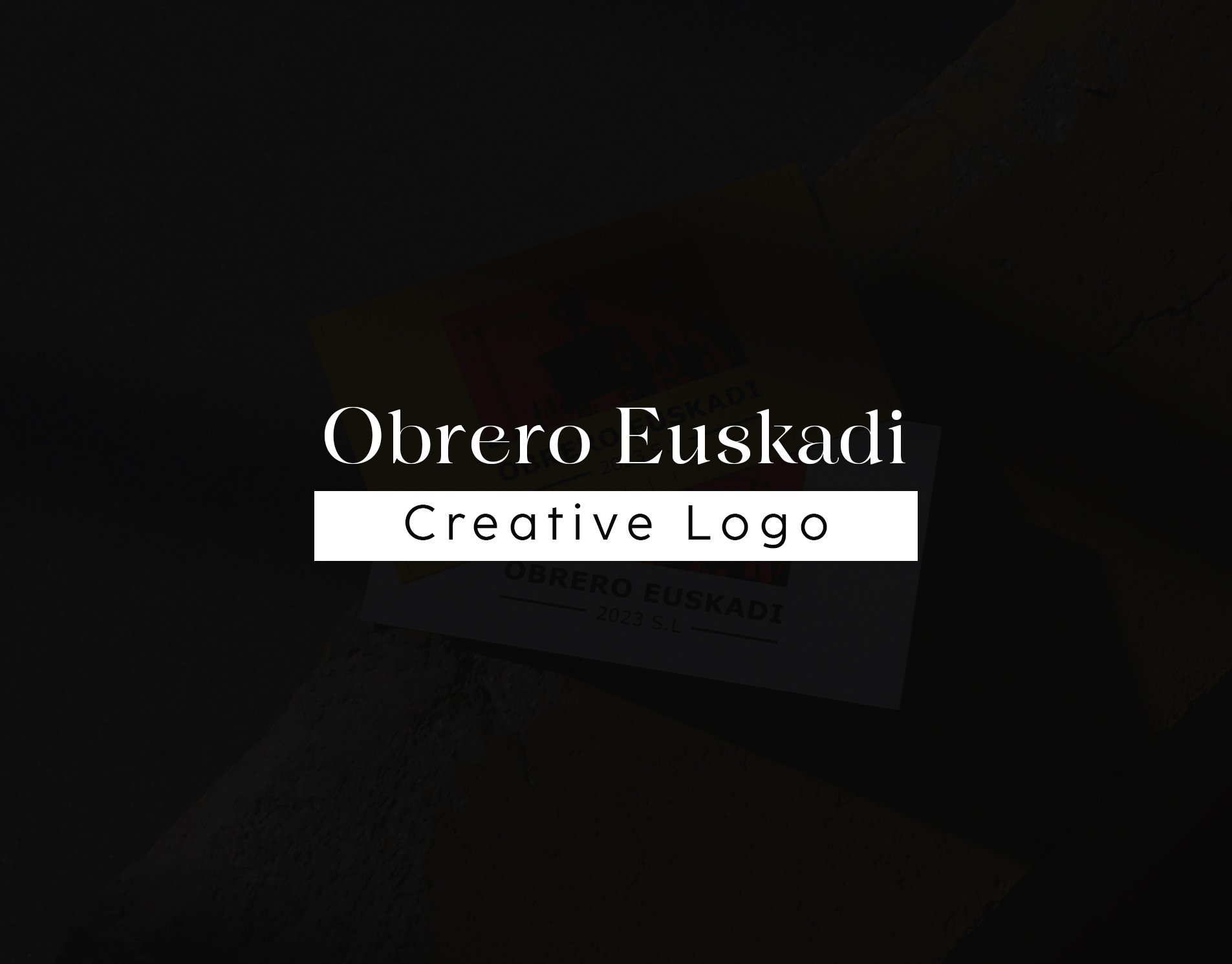
This project is a creative logo for Obrero Euskadi, a construction company operating in Spain since 2023. The objective was not to alter the brand’s original identity, but to visually reimagine it with a modern, confident, and contemporary tone. The redesigned logo reflects the discipline, effort, unity, and resilience that define the construction field, while presenting the brand in a bold and memorable manner.
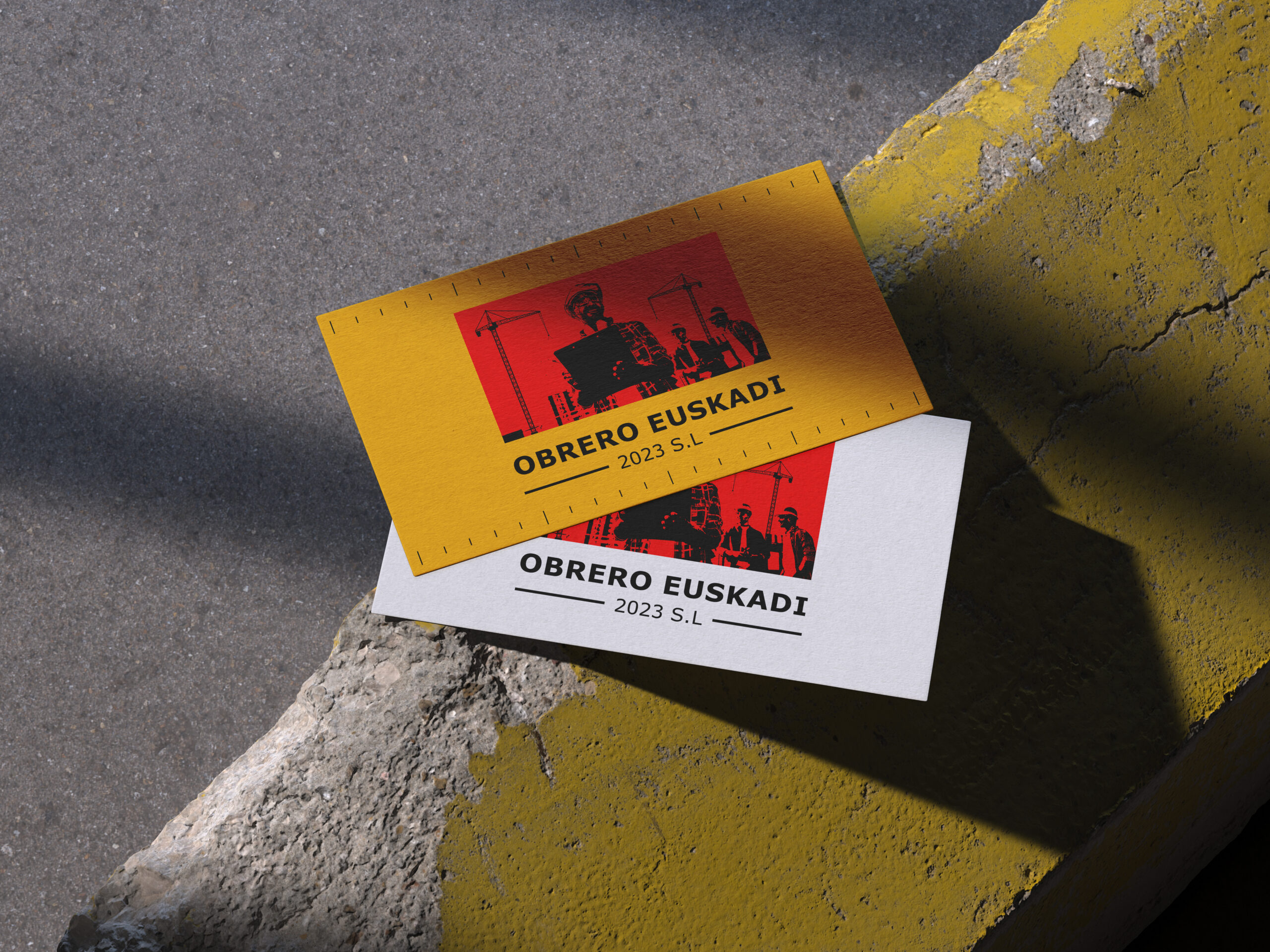
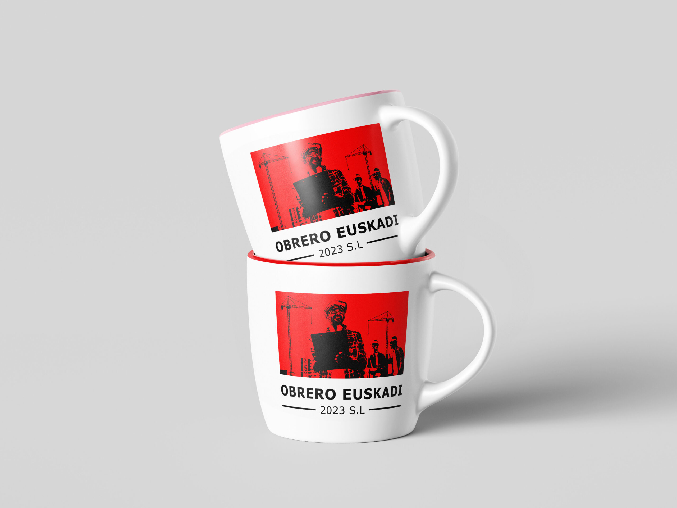
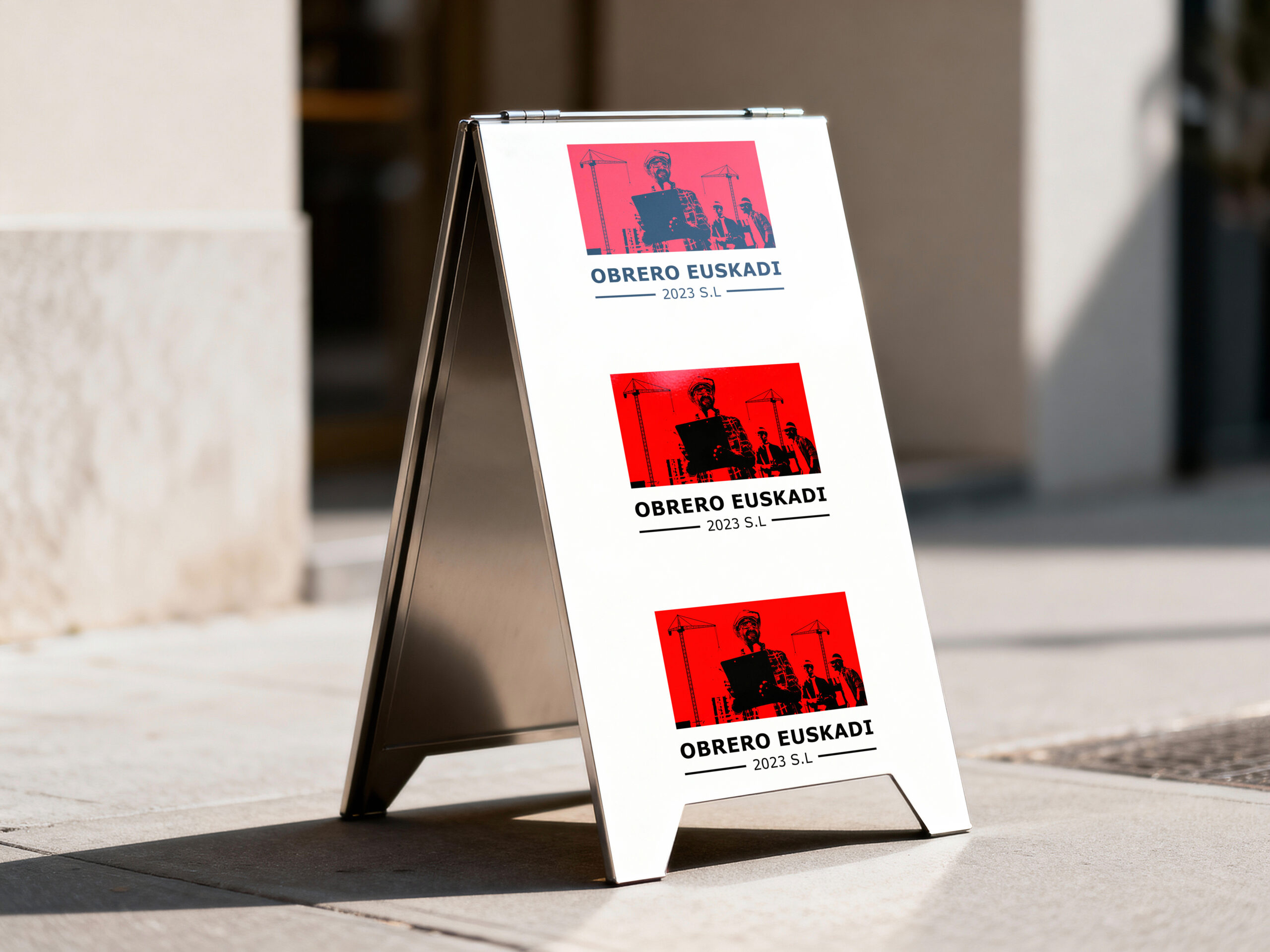
This logo was designed with a strong emphasis on bold composition, clear contrast, and a structured visual system influenced by industrial aesthetics. A dominant red color was used to represent strength, labor, and energy—core values closely associated with the construction industry. High-contrast black and white elements were carefully integrated to enhance clarity, legibility, and visual impact across different platforms. The repeated typography in the background introduces rhythm and reinforces brand recognition, while the centered layout keeps the logo visually grounded and well-balanced.
The inclusion of worker imagery and construction-related elements was intentionally stylized to reflect teamwork, leadership, and on-site professionalism. These visual cues help communicate the human side of the construction process while maintaining a clean and authoritative appearance. Each design element was kept strong, minimal, and purposeful to ensure the logo remains powerful, adaptable, and effective in both print and digital applications.
The overall design approach aligns with today’s visual culture, ensuring the logo feels relevant and impactful while maintaining its professional integrity. This work demonstrates my ability to translate industry values into a strong visual identity that supports brand presence and long-term recognition.
Logo Design · Graphic Design · Brand Identity · Visual Design · Modern Branding
My Creativity