Reimagining O Sathiyaa by Mannu with my creativity
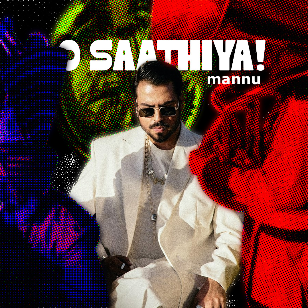
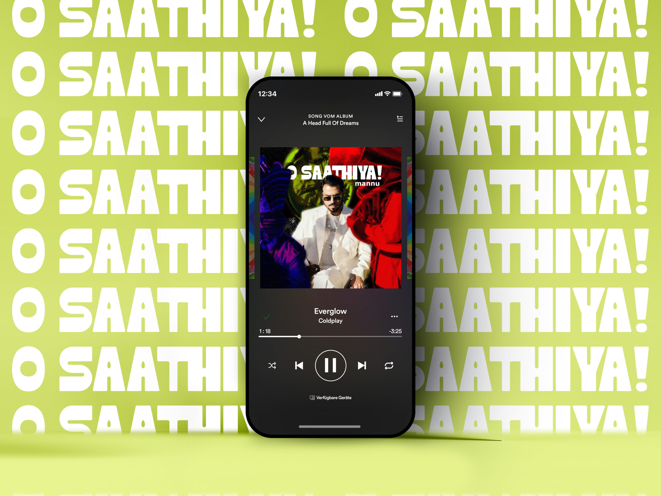
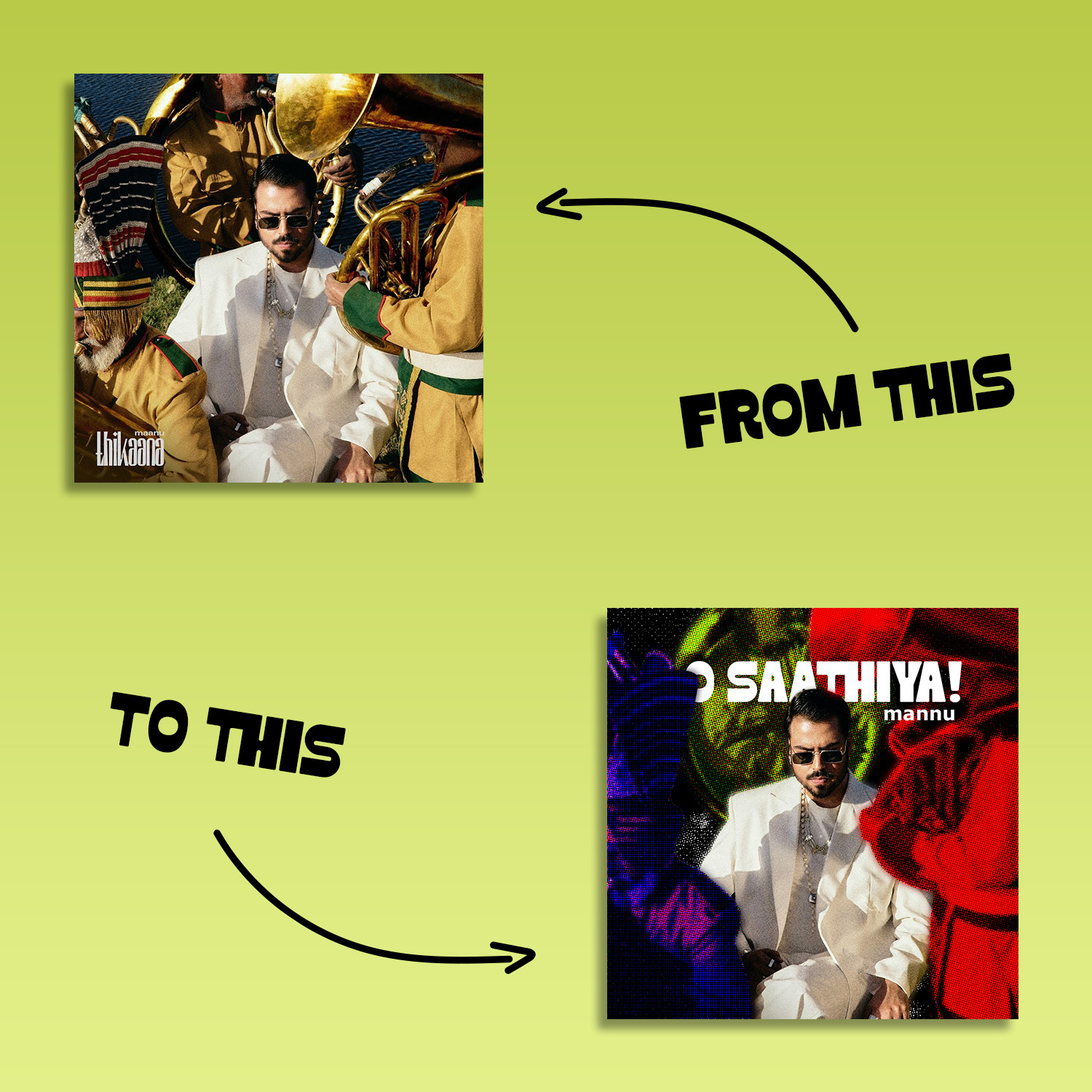
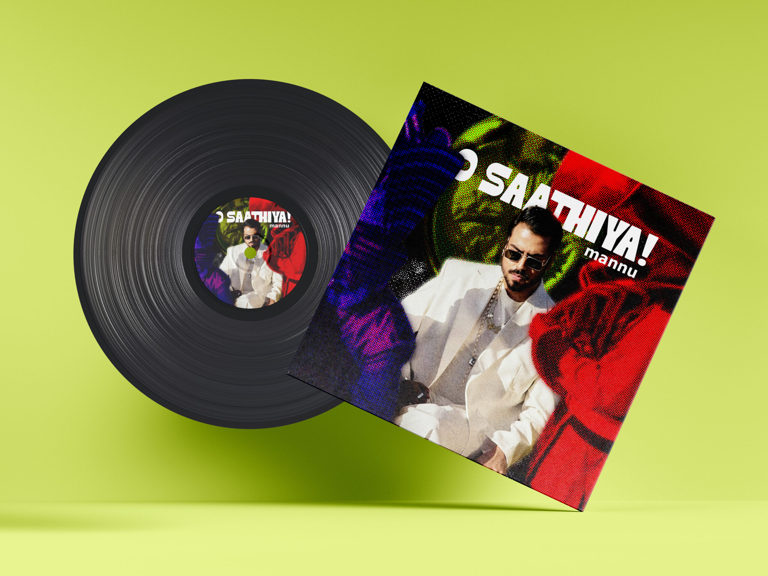
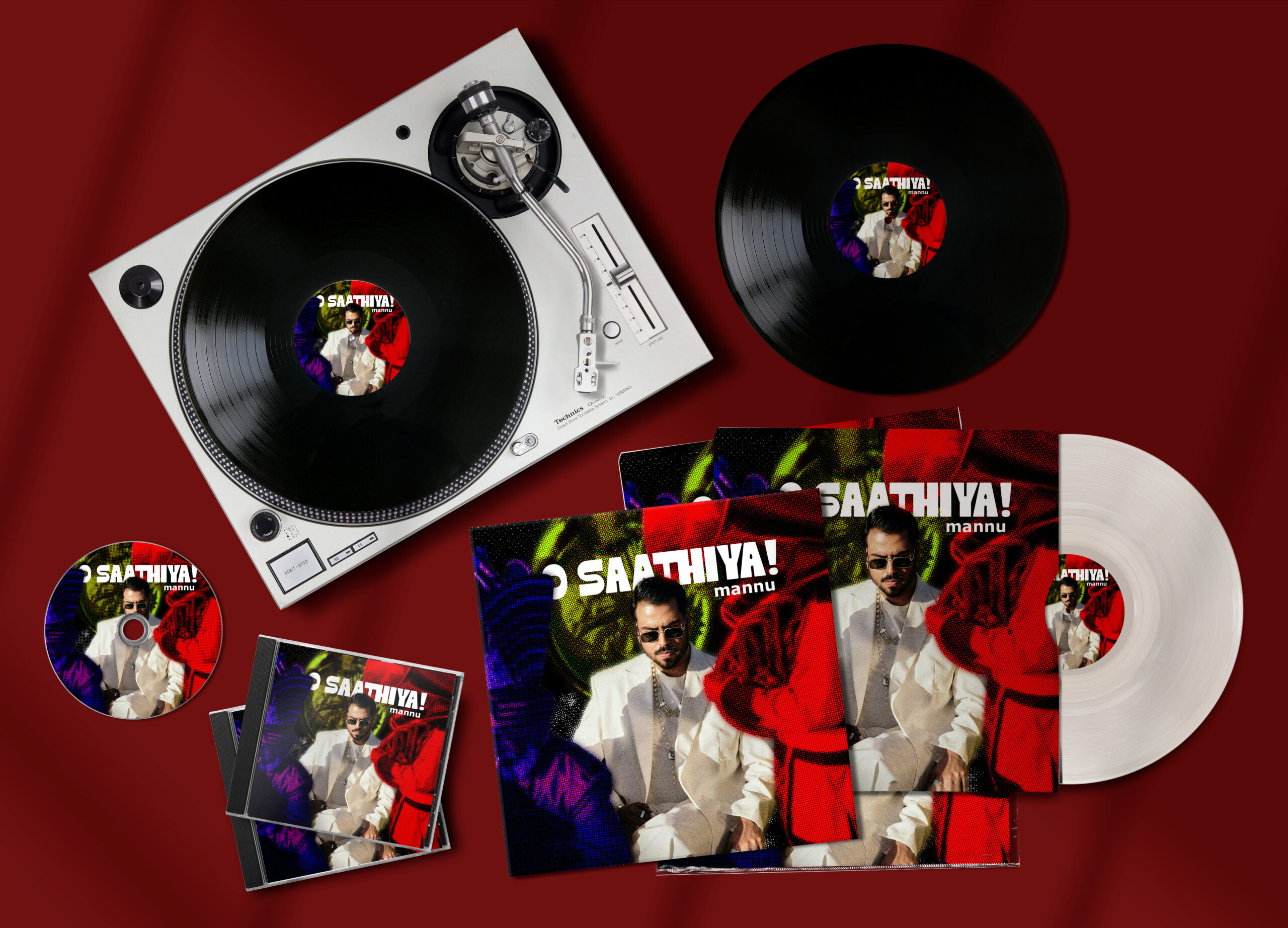
This project is a creative redesign of the official music poster for “O Sathiyaa” by Mannu, where I reimagined the original artwork through my own visual language while preserving the emotional essence of the song. Instead of replicating the original layout, my goal was to reinterpret the mood, attitude, and musical depth of O Sathiyaa using bold composition, color contrast, and contemporary poster aesthetics.
The design centers around Mannu as the focal subject, presented in a confident, composed posture that reflects the song’s emotional maturity. The clean white outfit contrasts sharply with the intense, textured background, symbolizing emotional clarity standing against chaos. This contrast was intentional to visually represent the balance between vulnerability and strength that the music conveys. The use of sunglasses and accessories adds a modern, stylish edge, reinforcing the artist’s persona and star presence.
The background is divided into vivid color zones of red, green, blue, and black, layered with halftone textures and grain effects. These elements introduce depth, movement, and a retro-modern fusion, inspired by contemporary music poster trends and experimental graphic styles. The halftone treatment not only adds visual energy but also connects the poster to classic print aesthetics, bridging old-school design with modern execution.
Typography is kept bold and minimal to maintain clarity and impact. The song title is placed prominently to command attention, while the artist’s name is subtly positioned to support the hierarchy without overpowering the composition. Every element from color selection to texture application was carefully chosen to ensure the poster feels dynamic, expressive, and musically driven.
This redesign reflects my ability to analyze original artwork, extract its emotional core, and recreate it through a fresh, concept-driven visual approach, making it suitable for modern digital and print platforms alike.
My Creativity